
This tutorial is to show how the Dahlia flowers were shaded on this card.

Select an image which has been inked with a dye base ink, so the ink will not smear (I don't care for pigment inks, hybrid inks or embossing powders (unless a very, very sharp pencil will be used to color near the raised areas of the EP).
Choose your colors by scribbling on a piece of the same color paper as your image. There should to be a significant difference in the colors so that the shading is effective.
For the dahlias below, three colors were used:
- lightest shade - Lemon Yellow (Jaune Citron) PC915
- medium shade - Sand (Sable) PC940
- darkest shade - Sunburst Yellow (Orange Solell) PC917
NOTE: I begin at the "6 o'clock position"for each layer when coloring detailed images, so I won't forget where I started. This is helpful if coloring in a room which is not well lit.
Color with the medium shade in all the areas where a shadow might be cast. Exaggerate the shadow so that it is bigger than desired.

Using the lightest shade, begin covering the image at the "6 o'clock position" of the flower, including the area previously colored with the medium shade. Color lightly and with compete coverage.


Next, beginning at the "6 o'clock position", apply the color of the darkest color in the shaded areas and even some of the tips of the flower petals. You may press harder to achieve stronger color if desired.

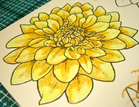
Finally, beginning at the "6 o'clock position", apply the color of the lightest color on top of the previous layers. Burnish with this layer, covering with a thick coat of color on each of the flower petals. At this point it is important to press the pencil going in the direction of the petal (the length of the petal). This last application is just as if you were using the "blender pencil". It blends the bottom layers with the top coat, giving a nice waxy finish, and wonderful shading.


Try using assorted colors, like blues, reds and purples in the veins of green leaves.
One more TIP:
Colored pencils are a unique medium. They should not be confused with markers. Therefore, your final result will not appears as if water colors, solvent inks, or other mediums were used. Expect colored pencil results - not results from other types of mediums. They really are a gorgeous coloring medium, and I enjoy them very much. I also enjoy applying chalk over them on occasion for even more intense shading.
Hope you enjoyed this tiny tutorial - I am no expert, that is for sure!
(please click on any of the photos to enlarge, and see more detail)
stamping hugs,

9 comments:
Fantastic tutorial De and thanks for taking the time to explain how you do your most wonderful shading...I so love this stamp..xxxx
Well you certainly achieved the result of an expert! Great tutorial - it's a medium that I've never really played with. Thanks for the incentive Donna.
Wonderful tutorial. I usually shy away from colored pencils because they aren't bright enough for me, but your dahlia is definitely the exception. Maybe it's that last layer you added that gives it a brighter color? Anyway, I'll have to try them again soon. Thanks for the inspiration.
Great job on this tutorial. I have used Prismacolor pencils for years. They are wonderful.
There is not a day that goes by that I smile when I read your comments. You say you are not an expert, however, I beg to differ with you. Nowhere have I seen cards as rich as the ones you make. Keep it up girlfriend!
OK, I can't read and type at the same time. Correction: ...that I don't smile when...
Thank you for this wonderful tutorial. My first coloring medium was pencils and NOT Prisma. I used crayola of all things...lol But I used to get good results. Now that I have copics, don't get me wrong I love them, but I still want Prisma. It's going on my Birthday/Christmas wish list this year. Your coloring in the yellow is so fantastic. I love the vivid color. It's just beautiful.
Bear Hugs,
Carol
Fabulous tutorial; the layering achieves beautiful depth and the colours blend so well together. Thanks for sharing!
Hugs, Dawn
Very nice tutorial, and a reminder that my colored pencils have been left behind by the advent of Copic Markers....don't use them enough and I used to love to color with them. Thanks for sharing.
Hugs
Sue
Post a Comment